Visual design rules every UI designer must follow.
To make your UI visually appealing and balanced, you need to apply right UI principles.

So, first thing first, UI is not just about how your interface looks, it is not something that you can differentiate as cool or boring. Every UI communicates something, it has colors, typography, and spaces to give you something to communicate. Not only this, but a great UI becomes an advocate for the great UX. An interface is the first thing in the roadmap of giving great UX to the users.
So, today we are going to talk about rules of UI which every UI Designer should understand to design the meaningful and purposeful UI.
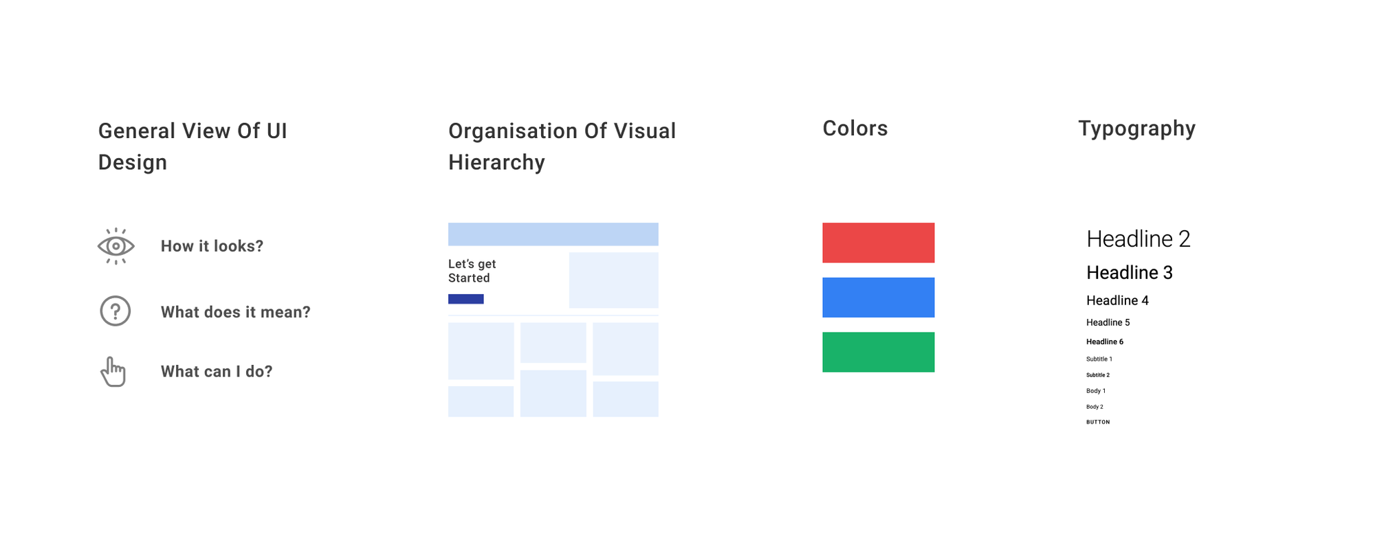
In this post, we are going to learn and talk about,
- General view of UI Design
- Organization of visual information
- Colors
- Typography
1. General View of UI Design
UI Design is the front door of every product. It is the first thing that a user or a customer will interact with and a well-designed UI should be responsible to take the user into the journey of the product.
UI design must be purposefully designed, you must deeply care about the things which you will be putting in the UI, every unnecessary item on the UI can create friction or unwanted noise to the users which eventually reduces the usability and separate out the product from the real purpose.
Communicating meaning and showing possible actions are the two major factors we design the UI for, and both should never be compromised in favor of visual design choices.
A great UI should always feel like it is communicating something to the user and clearly indicating what they can do on the interface.
A good UI is always built on the foundation of prioritizing information and defining clear actions.
So, let us next focus on how different factors play a role in putting out content and creating a meaningful structure of the UI.
2. Organization of visual information
Balance
Balance in UI is responsible for achieving a visual order and signaling relationships between components.
When designing a layout, take a step back and ask yourself if the overall composition feels balanced. Always ensure that not one element on the UI is taking too much attention and others are taking least.
Putting too much focus on one thing in the UI can take the user's attention from the real elements (unless it’s supposed too).
When the positive and negative things in the UI put together with a good sense of balance, then they work best together. Balance helps in putting related things together making it easier for the users to develop meaning and comprehend well.
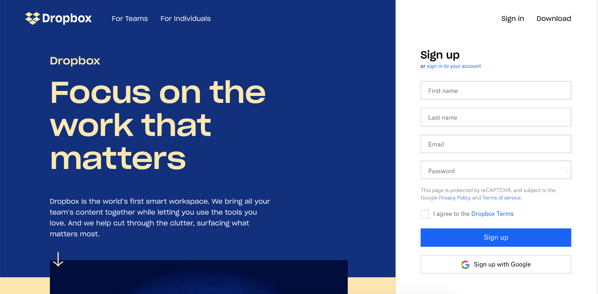
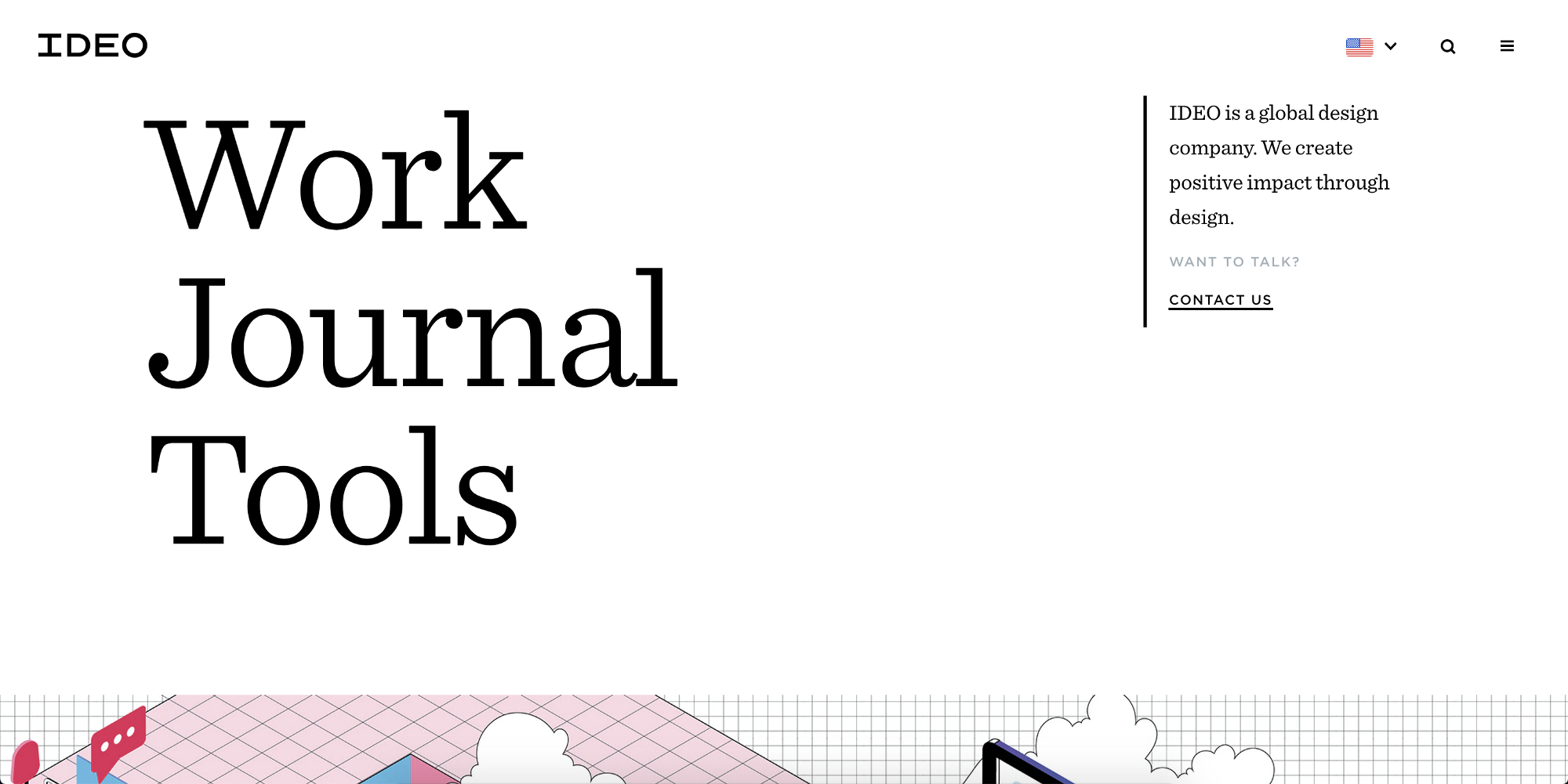
✅ Some good examples of well-balanced website,

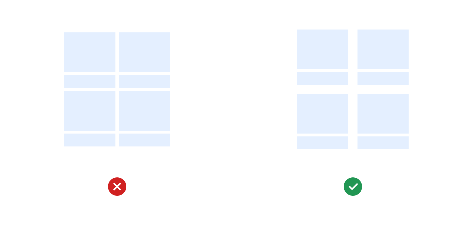
Rhythm
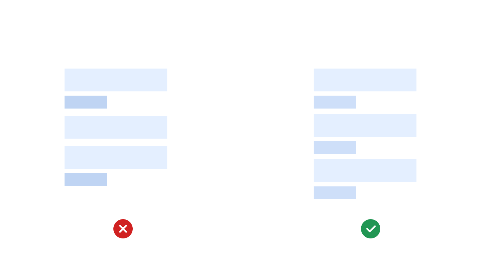
Visual rhythm can be created when the content is predictable and — similar in size, shape, and length.
Rhythm helps in creating a visual pattern of the information making it easier for the users to consume information. A visual Rhythm speeds up comprehension and use.
When building content discovery based applications or websites, always try to put the same content or group of content in one kind of rhythm so that information and actions become predictable to the users.
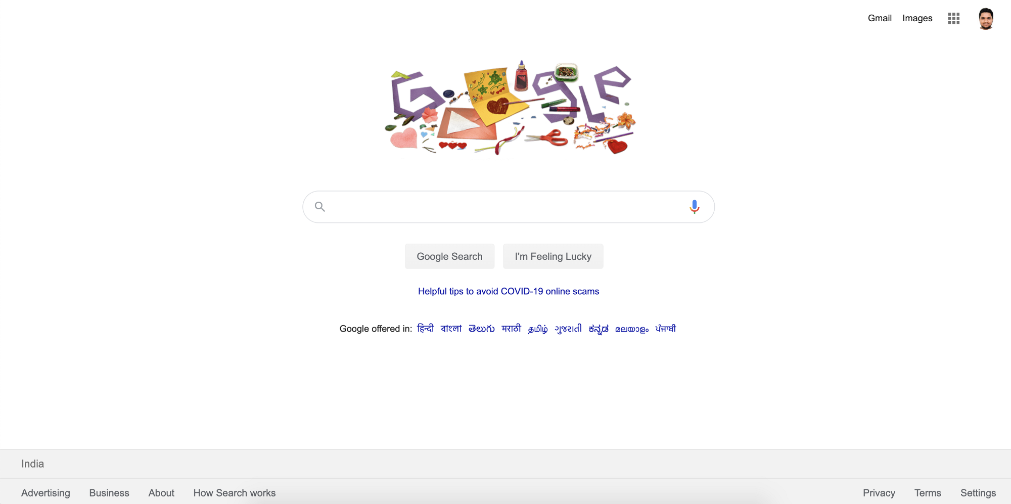
✅ Good Examples,
Harmony
When visual elements are in harmony, they relate to and complement each other. Harmony is something which holds the individual elements as a whole and gives a sense of directional flow the content.
Good Harmony in the UI can be achieved by the composition of a good balance of visual components and setting out a proper rhythm for the information.
When there is a mass amount of information on the UI, then there are cases of users being lost, in that case, harmony can play a role to direct the users in the right direction.

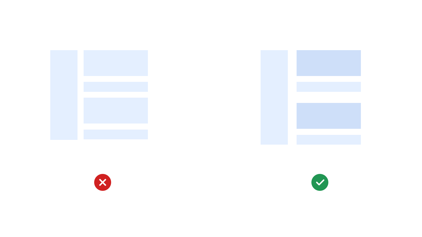
Dominance
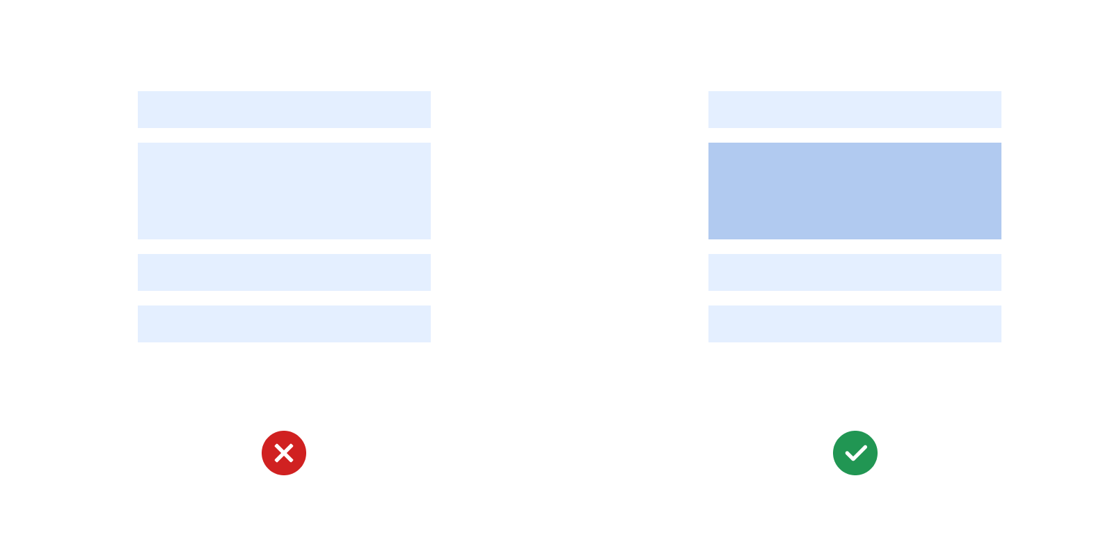
Dominance enables the focus in the UI, It creates a focal point where most people will instinctively go at first glance.
Dominance is necessary for grabbing out the user's attention to the most crucial action on the user interface. It can create an entry point for the users to start their journey. Specifying the necessary dominance in the UI helps the user to differentiate what is important and what is not.
When building a UI, we must be careful enough to divide the content based on dominance, We must specify the primary, secondary, and tertiary visual elements to build a proper hierarchy in the UI.
A well visual dominance can be created by size, color, space, and contrast.

Dominance should be carefully used with cognitive load. Meaning, using dominance as design should not become a cognitive load thing in the UI.

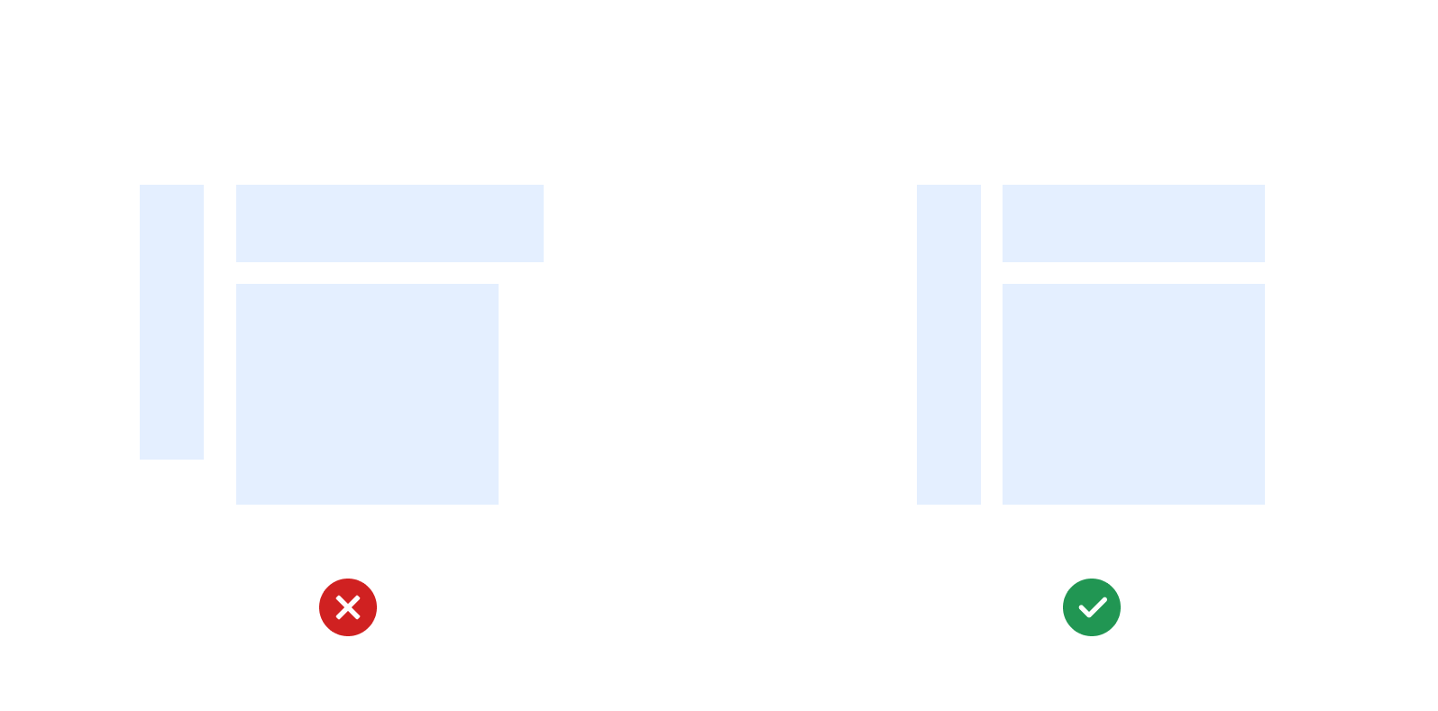
Alignment
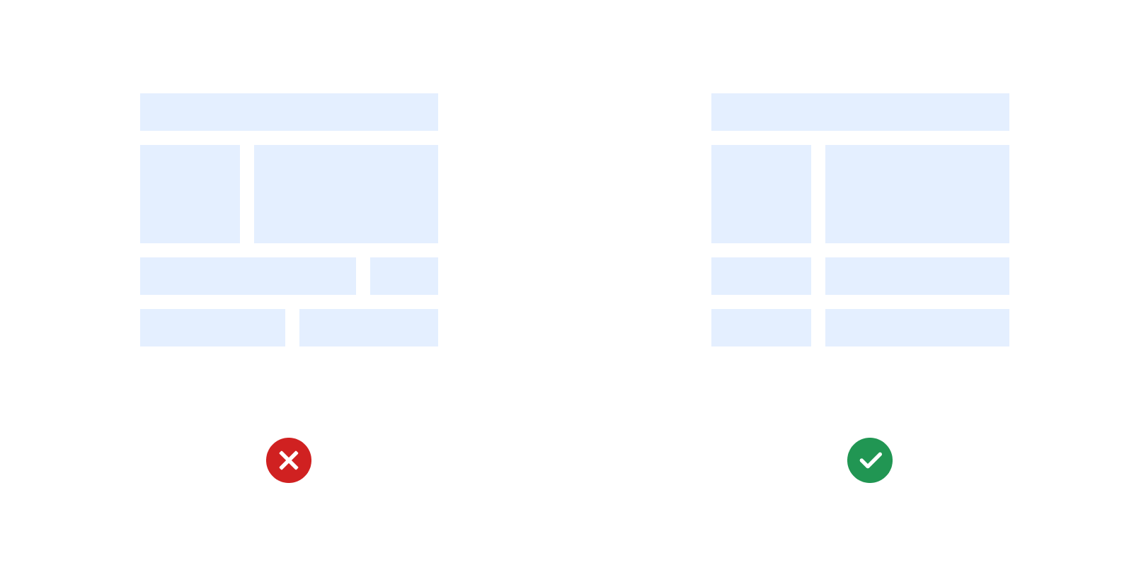
Alignment is the most essential UI design rule, and it is broken most of the time. Even if you do nothing and just use the proper alignment in the UI, half of the problem gets solved.
Improper alignment can increase the eye load of the users. You must have heard the statement, “People don’t read, people scan”. And it is absolutely correct. And this scanning is only meaningful and of use when visual elements are placed in the proper alignment on an interface.
A proper alignment creates a visual order, a better grid structure and an easy way to scan information.
Just align everything with everything else.
Proximity
Proximity is the distance between the visual elements. Proximity is used to convey meaning between the group of elements and describes relationships.
When elements are grouped together than they are perceived to be in the same group and related by the context of use.
Proximity makes the cognition faster.

3. Color
Colors matters, to evoke emotions, to communicate meanings, and to differentiate actions.
Colors are one of the key differentiators we can use in the UI and when used wisely, they can stir great meaning and emotions.
Choosing the appropriate colors is a critical task as colors have different meanings when used in different contexts. Like Red colors are generally used to show error or failure messages, and Green are used to show positive and success messages.
To get the desired results, colors have to be used appropriately.
60–30–10 Rule
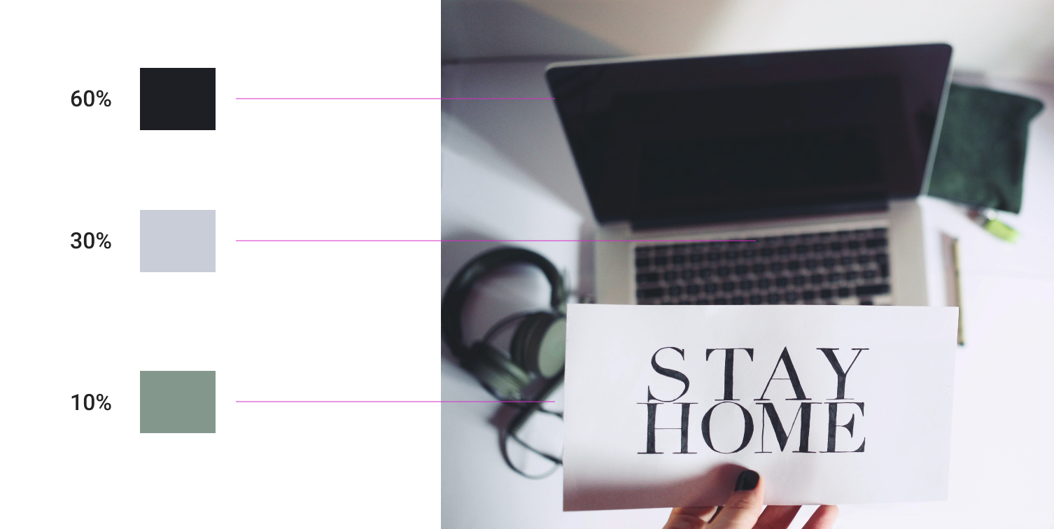
There is a rule of building a color theme which states that there must be three colors in the whole UI. You must choose a dominant color and use it in 60% of the space, another secondary so that it is at 30% and the last color for the remaining 10%. Yes, only 3 colors.
Colors must be collectively tested to check whether there are cases when they are unable to create meanings.
Contrast
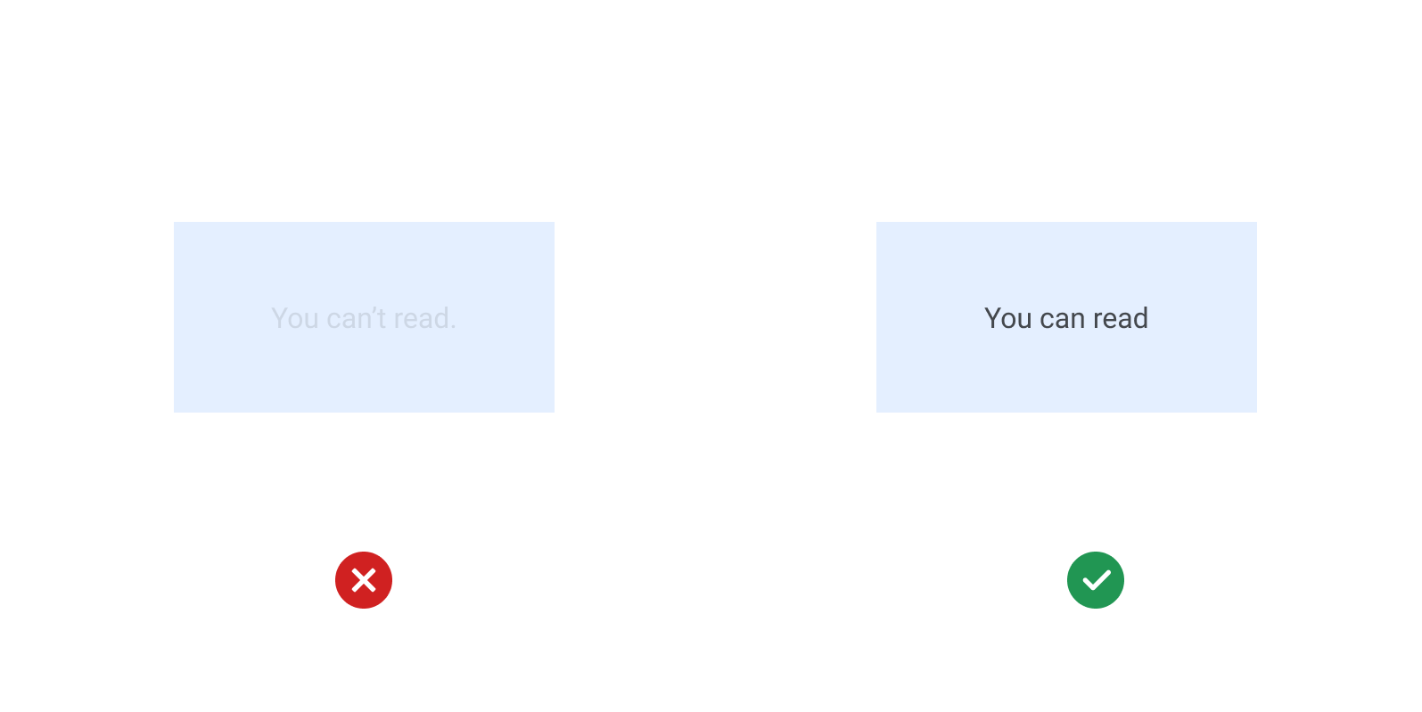
Contrast enables readability and directs the user’s focus. Contrast has a direct role in the accessibility of design.
Areas of higher contrast draw user attention first. What is more important that there must be a good amount of contrast between the foreground colors and background colors to make it readable.
Primary content should have a higher contrast as it draws user focus. The contrast must be purposefully used to draw the user's attention.

Contrast performs 3 essential functions,
- Contrast draws user attention to the most essential visual elements in the UI.
- Contrast helps users understand the relationship between onscreen elements.
- Contrast communicates hierarchy.
Contrast always wins.
4. Typography
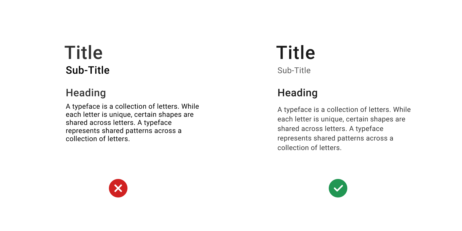
Choosing a font is not typography.
Typography is when you look purposefully combining letterforms to create optimal reading experiences. Appropriate typography is legible, readable, and usable.
70 % of User Interface depends on typography as it is the best source of communicating with anyone.
Bad typography could lead to bad experiences and can make it difficult for users to read and consume information.
So, to set the right typography, you need to,
- Set the font-hierarchy for clear communication.
When choosing the fonts for the content, you must always look for the fonts that would look readable and legible when they will be too big and also when they will be too small. - Specify the optimal spacing between characters, words, and paragraph lines.
When putting out the content on the UI, always give some room for the content to breathe and also make sure that spacing between them is proportionally right. - Align the text left, right, or center.
Using the consistent alignment throughout the product UI can speed up the scanning and readability of the users. - Set styles for visually differentiating content.
Use the right amount of contrast and color shades to specify the dominance and hierarchy of the content. Using the dark and light color styles for the content ensures the focus elements for the users. - Set the line length up to 60 characters.
Making the paragraph lines too wide on the UI screen increases the reading distance for the users, and it makes difficult for the users to comprehend and keep track of the last information. So always try to use 60 characters for a single paragraph lines no matter how long the content is.
Setting the right typography is as important as choosing the right colors and good organizational structure. And when it is done right, It provides a clear meaning to the users.
Conclusion
Gorgeous and beautiful UI is important, but they must not be compromised by not following the UI Design principles. So, regardless of the product or websites, you are working on, you must always consider the basic UI principles.
Thanks for reading.