My 30 Design challenge to create an eye for Design.
This story is all about my collection of good design and bad design. No matter, what you do and where you are, you are always going to be surrounded by things human have designed.

Being a designer, It’s our responsibility to create designs that others can use easily in their life. But to create such designs, you need to have an eye to observe design and able to define what is the difference between a good design and bad design.
About Challenge
So I took a 30 day challenge to collect everyday design from the digital to nature and observed them to know whether it is a bad design or good design.
I started this challenge on 20 July of the current year and ended on 20 August. Below, I am adding the things that I have observed and remembered to collect and click.
Note: I have not collected one thing every day rather I just collected things which I observed and remembered to take note of.
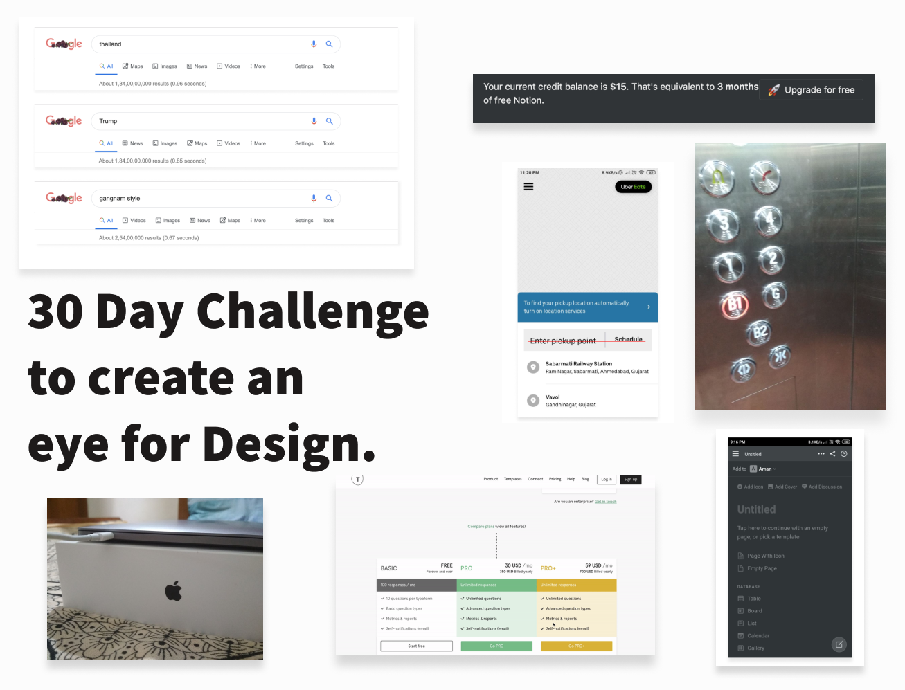
Here are my collection of good design and bad design.
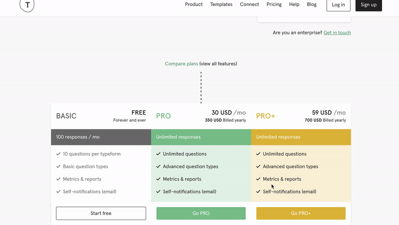
1. Buttons position while scrolling — GOOD DESIGN 👍
While scrolling the page, the CTA buttons are fixed so that users can choose any plans without scrolling full page.
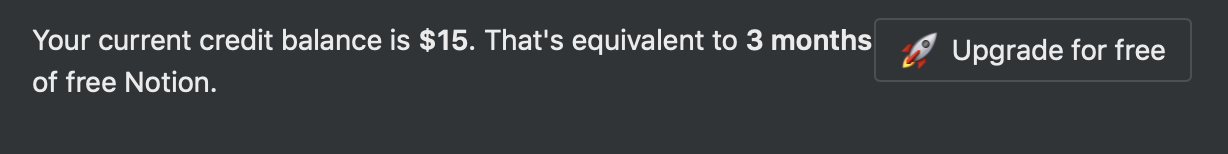
2. Meaning of the credit clearly written in the simple way. (credit Notion) — GOOD DESIGN👍
What does a $15 credit means for the users is clearly written in simple text form “That’s equivalent to 3 months of free Notion”. Example of Good UX copywriting.
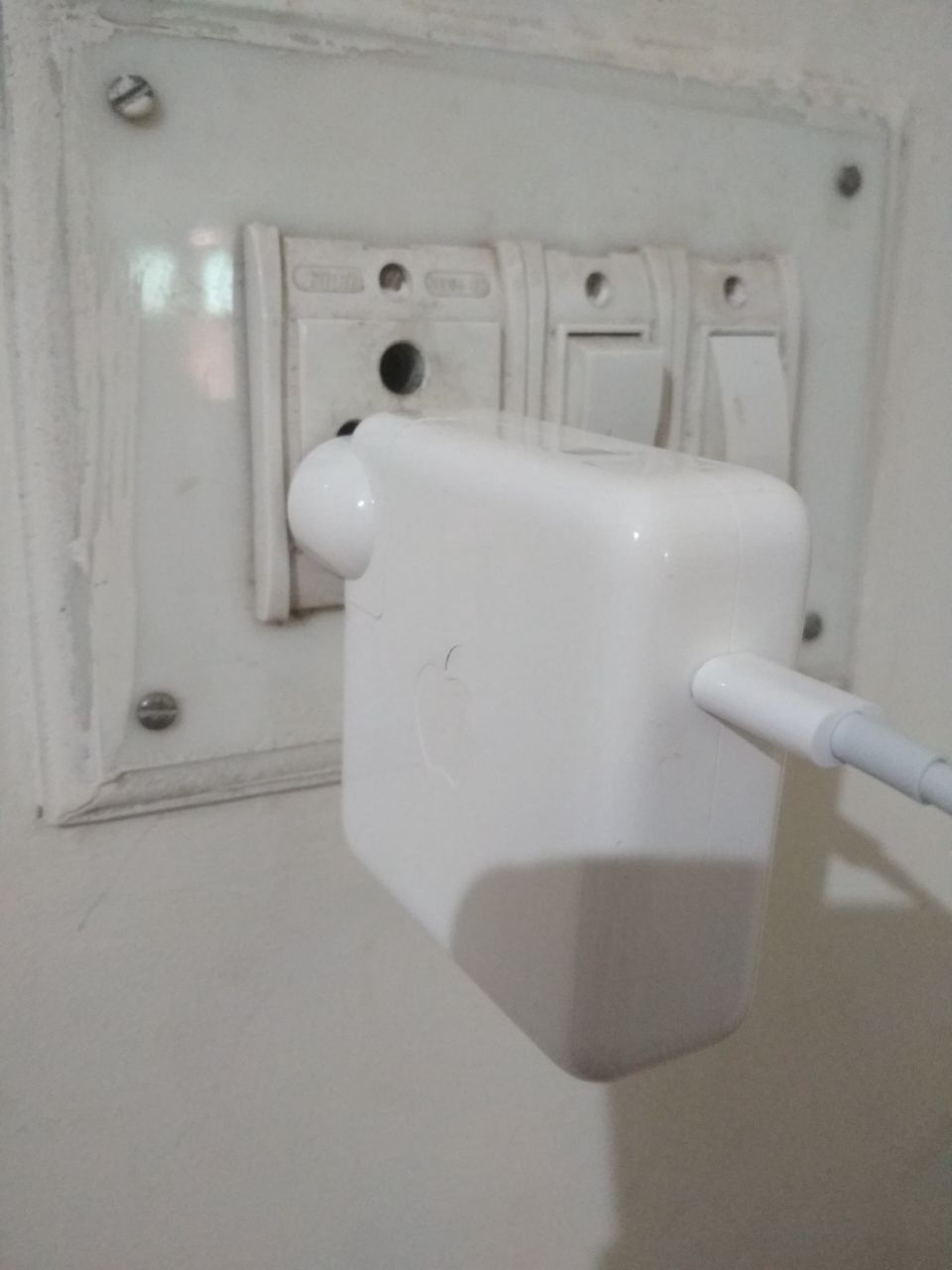
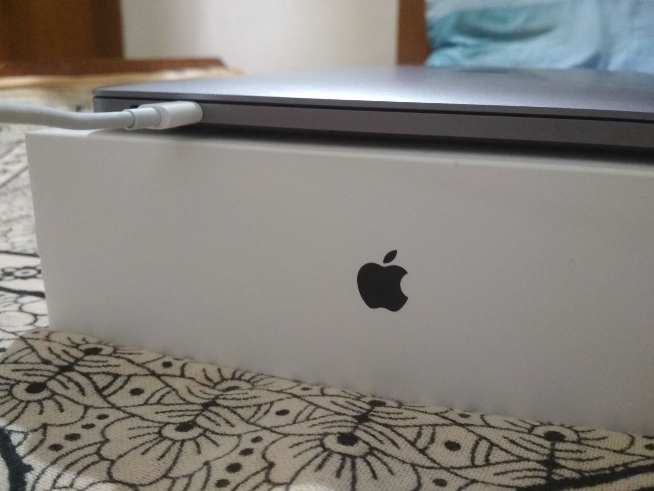
3. Bad Design of Mac Charging signifier — BAD DESIGN 👎
There are no signifiers to know whether the charging has started or not. You would only got to know once you open the macbook. Does not follow the Don Norman’s Design Laws.
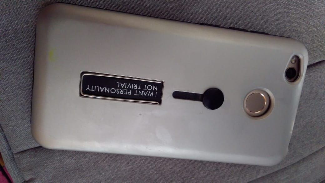
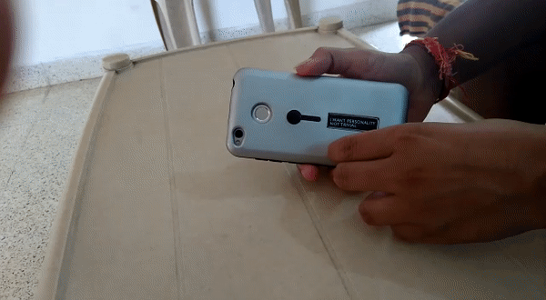
4. Wrong way to design the switch button to take out the black strip — BAD DESIGN 👎
This is my phone cover and there is black strip which you can take out by moving the black button towards down. It’s follow the material design like switch which makes it unstable on the table when placed with the backside.
5. Icons in the notion app — BAD DESIGN 👎
When you open the notion app, you would find that the icon used in the notion are way smaller than you fingers point. They don’t follow one of the UX law, i.e. Fitts Law.
And instead of plus button, They have a edit icon as the FAB button to add the new Note or content.
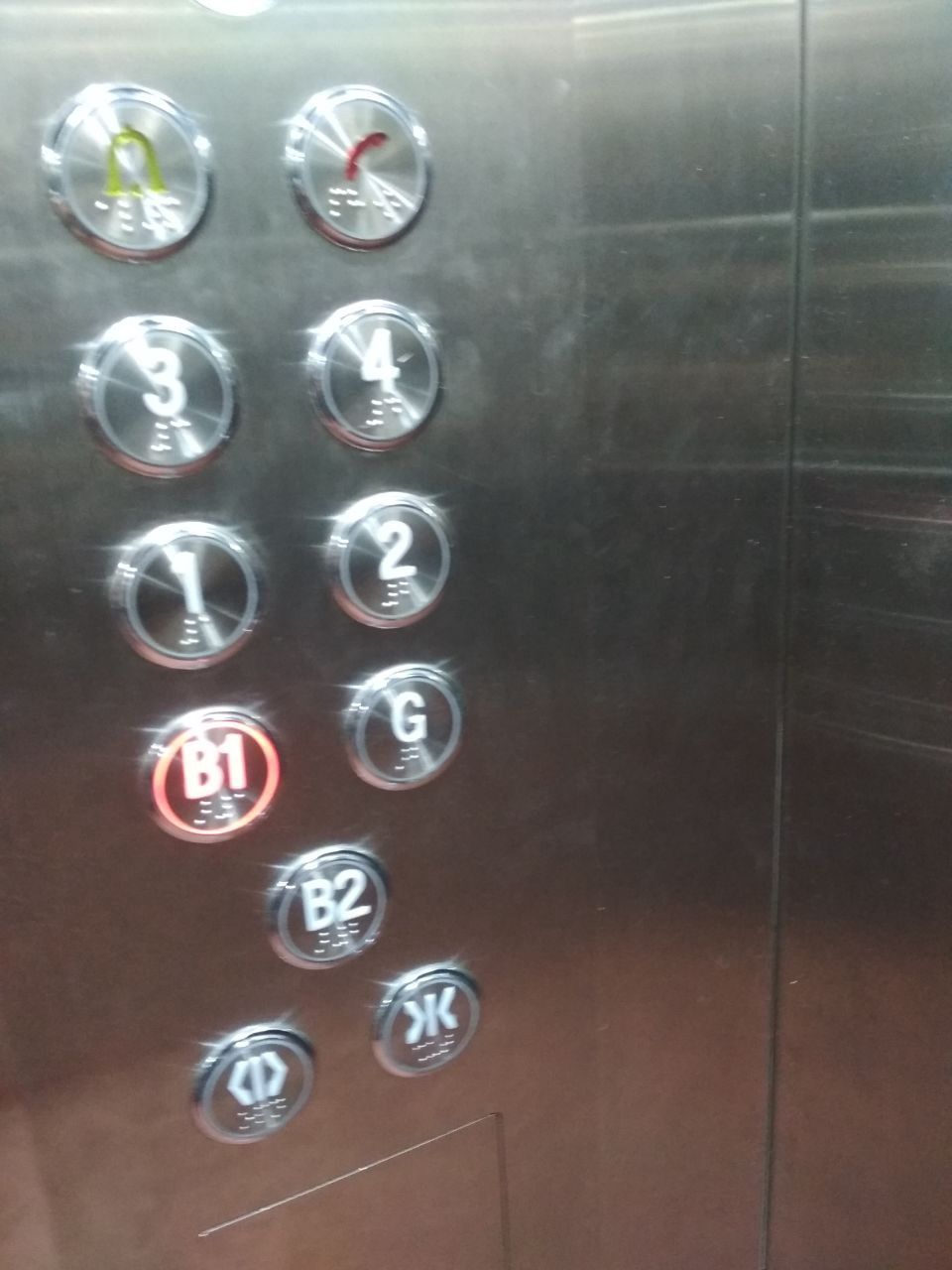
6. Lift button design — BAD DESIGN 👎
This is the button structure of the lift in my office building. First of all, buttons are not placed in order. Second, most of the people considers Basement 1 and Basement 2 as -1 and -2 and alway talk about in terms of -1(Basement 1) and -2(Basement 2) but in the lift button structure there is B1 and B2 written, which creates a different mental model for the users to think before choosing the basement.
Example of bad mental models.
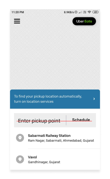
7. Misalignment of Enter Pickup point and Schedule Button in the Uber App — BAD DESIGN 👎
We can clearly see the wrong alignment of the enter pickup point and schedule label in the text field.
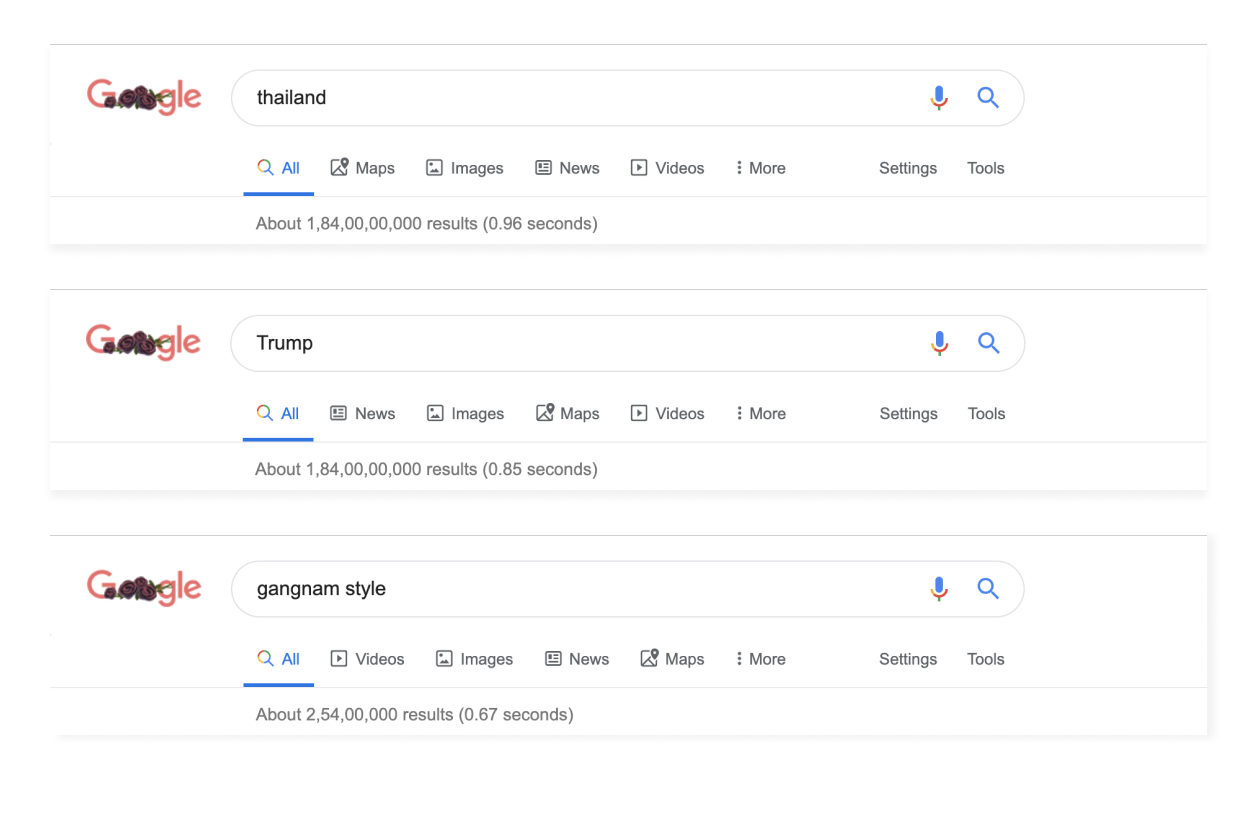
8. Google search engine different tabs view while searching for different Queries. — Good Design 👍
Google has perfectly designed their search engine, It always gives your the best result for your queries. Below we can see how the tabs are designed to arrange in different orders based on the queries, like for a place query, we have the “Maps” as the second tabs and for the gangnam style, we have the “Videos” as the second tab, and same for the Trump query, we get the “News” as the second tab.
9. Text input field in the Chrome pdf viewer to go to any page — Good Design 👍
When viewing any pdf in the Chrome pdf viewer, Chrome provides a text input on the page counts for the users to directly jump to corresponding page.
Good example of affordance and signifiers in Design.
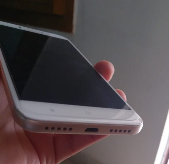
10. My phone speaker at the bottom of the mobile phone-Good Design 👍
One thing I just love about my phone is that my phone have the speakers at the bottom side. Most oftenly, while listening songs or watching videos, People have to drop down the phone from the front side, because they have speakers at the backside, so listen the songs they have to keep speakers open.
But I don’t have to do this as my phone has speakers at the bottom.
One thing is also designed well in my phone is that, my phone microphone and speakers are at the same position making good and fine conversation while talking on the phone.
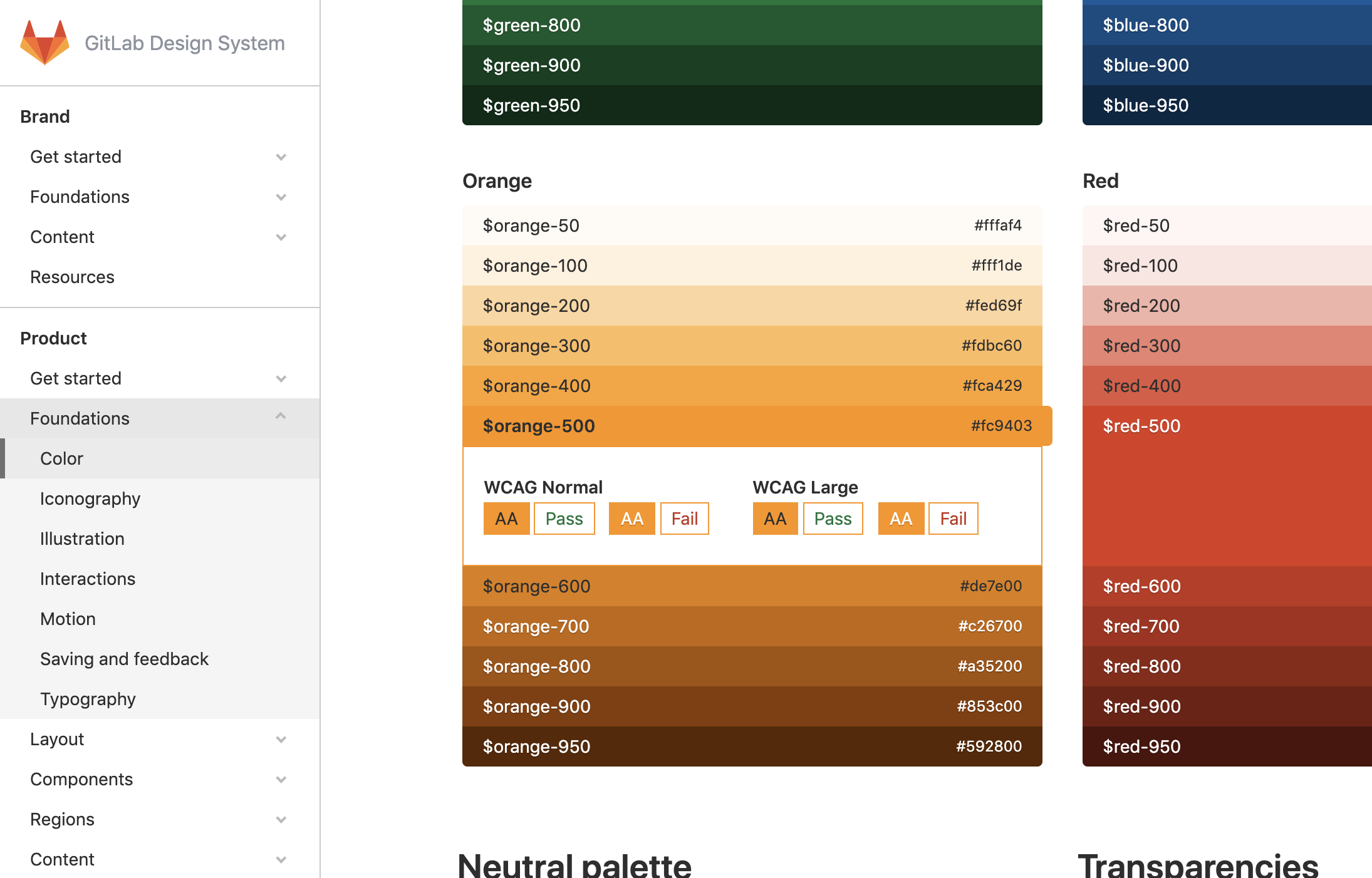
12. Showing color contrast in Gitlab Design system — Good Design 👍
Gitlab Design system, commonly known as Pajamas Design system has this wonderway way of showing the color contrast ratio before picking up any color. There is no need to check the contrast color ratio on any different tool or website.
So these are some of the good design and bad design that I have collected in my 30 days time period. They are few examples but they are something which I remembered to collect while doing my work.
If you got any good design and bad design examples, Do share with me.
Thanks for reading.