Common UI/UX design mistakes young designers should avoid
Mistakes in the design phase often lead to a cycle of rework in the product development process. So, It is always best to avoid and take care of mistakes that might occur unknowingly or knowingly.

Mistakes in the design phase often lead to a cycle of rework in the product development process. So, It is always best to avoid and take care of mistakes that might occur unknowingly or knowingly.
So today, I am going to talk about 3 UI/UX design mistakes we should avoid while designing the UI/UX of products.
1. Test your UI with an actual web browser/ Phone user interface.
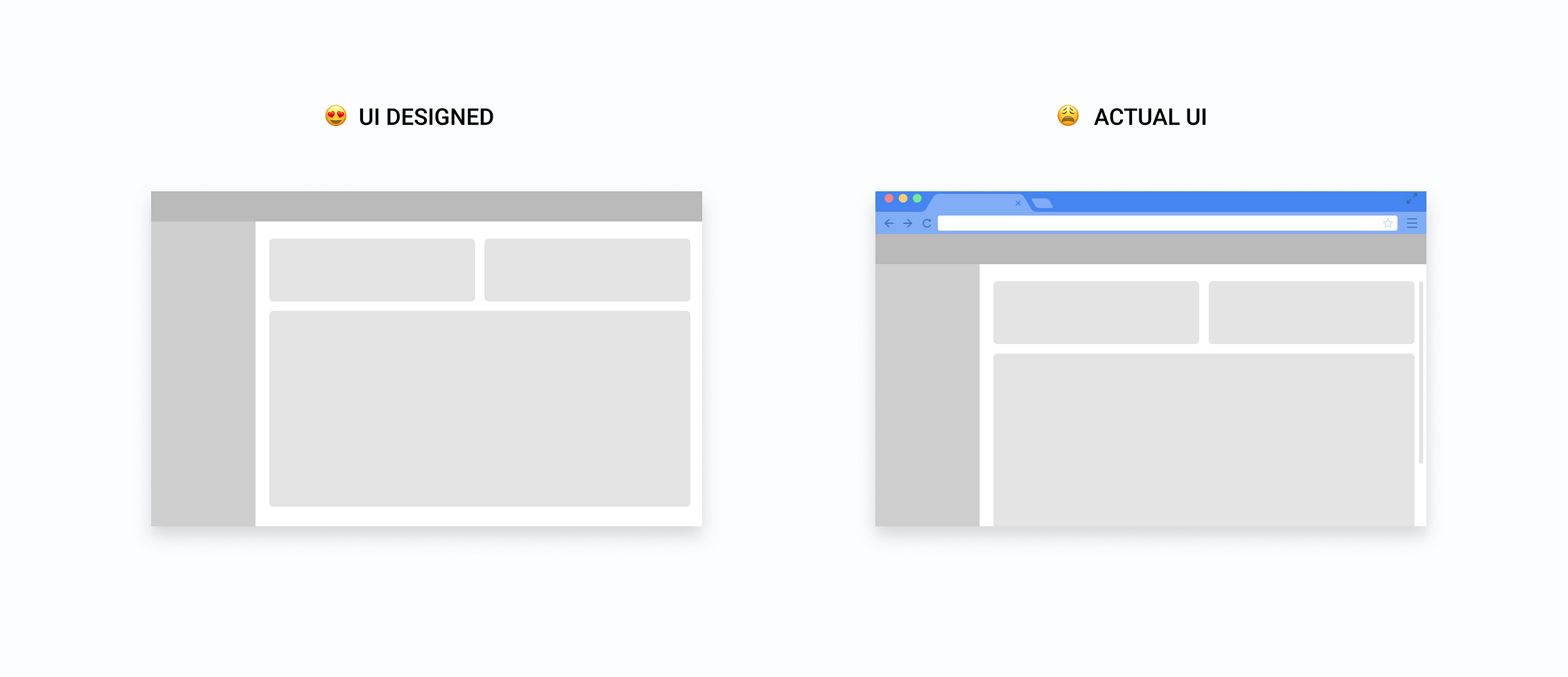
Most of the time we make mistakes of designing UI pages with leaving some of the design below the fold or under the scroll.

The reason why we make this mistake is that we always pick the default artboard in the design tool and start designing from top to bottom without considering the real browser or phone height for which we are designing for. (This happens a lot in B2B products)
For the B2B products, most of the time, we consider the whole of the artboard in the design tool and start designing and placing the different UI components considering the full height, but what happens after the development, we get a lot of design request about things going below the fold or under the scroll. And then we get to rethink the whole design considering the actual height, which not only changes the UI but sometimes requires to rethink design decisions.
So, being a UI designer, we can ask our clients to give us the browser metrics of their products (If they have) or we can test our design with different browser windows in different screen sizes. (Remember responsive design is different)
2. Cross-check your design with real data before giving it to the development team.
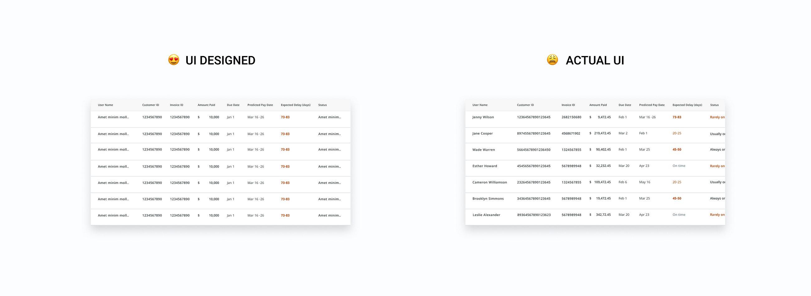
Having real data at the start of the product design might be difficult or in some cases, there are chances that you will not have that. But not having them should not be a reason to not test your design with them, you can always have some dummy data, but the real one(Say no to lorem ipsum).
Applying the data to your UI components will always help you in deciding the spacing and margin that should be given to particular components or between components. Even in some cases, when things are mandatory or necessary to be shown, you can decide how much data to show or how much to hide.
For example,
You have designed a table with random data without considering the actual characters of data or what might come in the rows, then there will be chances that when you put real content, your content might float outside the table or you have to adjust your spacing to accommodate them or even in bad scenarios, you have to reconsider the whole designs.

So, it is always best to apply or add real data to your designs, and if there are issues just change the design or make a decision that is scalable for your future designs.
Placing the real data in UI is always the best decision.
3. Not considering all the states of a flow or Experience
It’s going to be a rarity that you create a screen in your interface that has only 1 state. The reality is that the world in which we live isn’t perfect, and things go wrong. Servers take time to respond. And your users won’t always use your product the way in which you intended.
When you are designing the experiences, you must always think about the complete experience, from the start to the end, also in-between states, edge cases like what will happen when there will be an error, or how would the UI look like the first time.
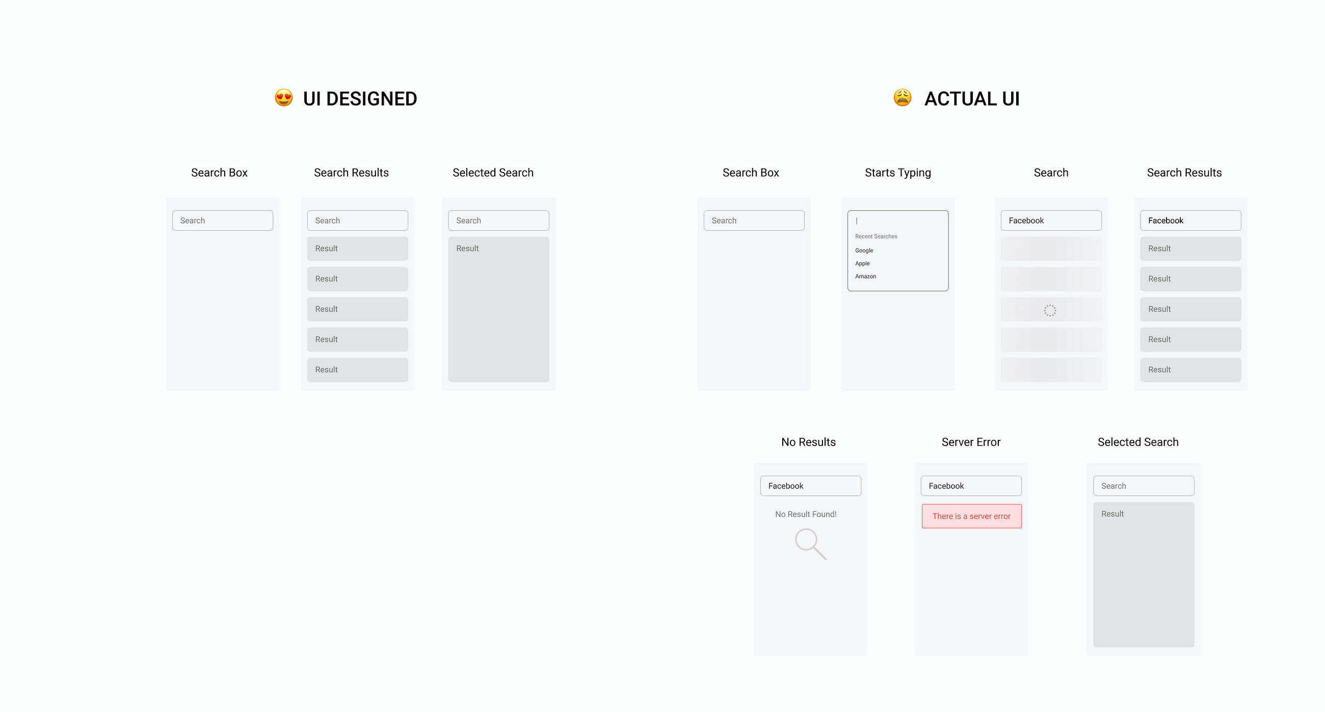
Suppose, If you are designing a search feature for your product, then ideally you would think of the following states,
- Search Input box,
- Search Results.
- Selecting a search
- No results found (Empty State)
But if you think of searching elements as an experience then you would realize that you have missed some of the states.
So, let’s us consider all the states that might appear in your product’s search experience,
- Input Box.
- Hover state.
- When you click on the search box, there will be some recent search or there might not be.
- How you will show when users start typing the search.
- When you select an option, how would the search loading look like (skeleton screen)
- How would be the empty state screen if there are no search results (Empty State)
- What will happen when the user clears the search (User Cleared State)
- What will happen if there are server errors or system errors (Error State)
- What will be the ideal state (Search results)
- What will be the partial state (Between empty state and ideal state, when there are 2 or 1 search results)

All of these states(cases) are part of what the users might experience. And leaving any of these will leave a gap in the overall user experience of the product. So, being a good UXer, always try to include and design all the state or edge cases that your product feature might go through in reality.
Conclusion
The above mistakes are such mistakes that you might make unintentionally, but making them might result in continuous design requests from your client development teams, eventually increasing your design work. So, before reaching to the final designs, always confirm and make sure whether you are making these mistakes or not, if you are, just design them well.
Happy Designing and thank you for reading.

